
Tuesday, November 25, 2014
Blog Post 7
This week, more points were added for battles that took place during the War of 1812. Another task that still has to be completed is the separation of each war onto its own map to avoid any cluttering of different points. Another task will be to symbolize each point based on the total number of troops present as a means of showing the significance of each battle. Other field of information that could be added to the attributes of the points or to the map itself is still open to suggestions as well. Overall for this coming week, some more changes are very likely to happen soon to diversify this map and make it appear more organized and easier to read and understand.
Tuesday, November 18, 2014
Blog Post 6
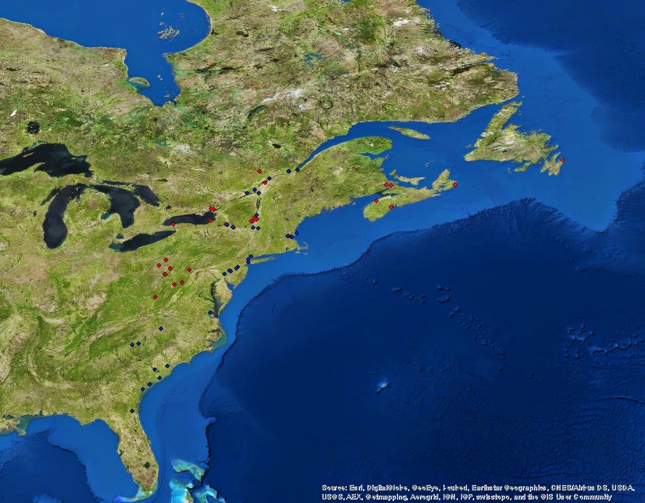
This week, more data points were added including the start of the War of 1812. The points were also expanded in size to make visibility clearer. More attributes were also added including the number of troops on each side and the total troop count when the two sides are added together. The reason for the summing of the opposing sides is because I plan on making a graduated size map out of these points correlating size with the total number of troops present at that battle. I am also considering maybe creating separate maps for each war to avoid any cluttering of my points but I'm not 100 % sure on this yet. For the next few weeks, I plan on adding more points for the War of 1812 and maybe adding more attribute fields that give more information on each battle. Some adjustments to the basemap in the background of the map may also be made in the future to help visibility such as using a flat, single color basemap as oppose to the world imagery map but these choices are up for debate.
Current Map:

Current Map:
Monday, November 10, 2014
Post 5
Last week more points representing Revolutionary war battles were added to the excel spreadsheet. For the map, the points were selected by the war they belonged to and color coded to differentiate each battle between the French and Indian War and the American Revolution. The red points represent the French and Indian War while the blue points represent the American Revolution. These colors are only a temporary change used to keep the points organized into categories. Later I plan on coming up with a better set up for categorizing the points either based on the war they belong to or their outcome. This week I will try to add more points to finish up the Revolutionary War and move on to the War of 1812 as well as focus on an efficient way to design this map so that it is interactive and easy to follow. A series of different symbology shapes for each pint as well as color will most likely be used to display the final sets of points for each war in the future.
Monday, November 3, 2014
Blog Post 4
So far this week, all points representing historical battle fields of the French and Indian War have been plotted on the project map along with complete attribute data for the fields of Name, Latitude, Longitude, Date, and Outcome of each battle. Some points for the first opening battles of the Revolutionary war have also been plotted. For future objectives for this project, the rest of the points for the Revolutionary War will be plotted on the map and more fields for the attribute table will also be added such as opposing nations in the battle and the numbers of soldiers for each side. Points will also hopefully be categorized into each war so that each point can easily be distinguished for the war that it was fought during.
Current Map:

Current Map:
Subscribe to:
Posts (Atom)